IssueNo. 01
2026MMXXVI
Cover · MMXXVI
A vintage polaroid of Sarah in soft daylight
— cover girl, on a Sunday —
The Sarah Edit · A Collection of Design, Research & Creative Explorations

Understanding  People.  Designing  Experiences.

A vintage-style portfolio by Xinyi (Sarah) Hu — UI/UX designer & researcher, where psychology meets creativity & design.

UniMe · Wear What Makes You U
A note from Sarah

Hi, I'm Xinyi (Sarah)!

Junior at the University of Washington, Seattle. Majoring in Psychology, minoring in Data Science. Drawing people, behaviour, and craft into one picture.

Welcome to My World

This is my personal website — a small magazine of my design journey, UX research work, and creative explorations.

My interests lie in human-centered design, UI/UX design, and user experience research. I'm especially interested in understanding human behaviour and using research, creativity, and technology to design meaningful experiences.

Beyond the screen, I draw inspiration from art, fashion, Chinese dance, and music — violin and piano. Each piece of this portfolio is a small love letter to the way people think, feel, and choose.

"Feel free to explore my work."

Human Behaviour

Psychology-trained research with empathy at the centre of every design decision.

UX Design & Research

Survey to prototype, persona to pixel — full-cycle case studies with clear reasoning.

Creative Expression

Editorial aesthetics, vintage scrapbooks, Shibuya street style — design with personality.

· · · Selected Work · · ·
Issue No. 01 — Featured Case Study

UniMe — A study in outfit planning

A personalized outfit-planning experience designed around the wardrobe you already own.

Featured Project

UniMe

Wear What Makes You U.

UniMe helps users make outfit decisions using clothes they already own. Discover combinations, get personalized recommendations by weather, style, and occasion, and organize looks on a calendar — making outfit planning easier, more efficient, and more enjoyable.

UX Research Product Design User-Centered Design Prototyping Usability Testing
Explore Case Study
Cover Plate · UniMe Patch
UniMe embroidered denim patch — the cover plate for this case study
01
· · · The Full Case Study · · ·
 

The Full UniMe Case Study — 13 Steps of Thought Process

01

Project Overview — The Big Picture

The product

UniMe is a social fashion platform that helps users plan daily outfits, discover style inspiration, buy and sell clothing, and express their personal style through a customizable digital avatar. Target users span students, working adults, and older adults — anyone who's ever stood in front of a closet wondering, "What do I actually wear today?"

The problem

People struggle to choose appropriate outfits for different weather, seasons, occasions, and moods. Getting dressed becomes time-consuming and stressful — especially when those four variables don't align.

The goal

Design a mobile (and later, web) application that helps users quickly and confidently select outfits that match the weather, the occasion, the season, and their personal style — without second-guessing.

My role & responsibilities

Role: UX researcher and designer (independent project). I conducted user research, defined user needs and project goals, created wireframes and prototypes, ran usability testing, and refined the design across two iterations based on participant feedback.

02

Understanding the User — Listening Before Drawing

Before opening Figma, I wanted to know what people actually struggle with when getting dressed — not what I assumed they struggled with. So I ran two studies in parallel:

  • An online survey with 70 participants — to map habits, needs, and pain points around outfit choice and shopping.
  • A usability study with five participants using my low-fidelity prototype — to observe real behavior, not just opinions.
What I assumed going in (and how the research pushed back)

I went in thinking users would mainly want help deciding what to wear and planning for future events. The research widened that: users also wanted help matching clothes they already owned, finding outfits for specific occasions and weather, and discovering combinations they wouldn't have thought of. Two nuances changed how I prioritized features: some users preferred to browse categories instead of searching, and not everyone wanted a calendar.

"The original assumption was about deciding what to wear. The research was about deciding how to feel while wearing it." — Research Note, Aug 2026
03

Four Pain Points That Shaped the Design

After clustering the survey responses, four pain points surfaced again and again. Each one became a design directive for the prototype.

i
Decision overwhelm across too many variables

Users feel overwhelmed because weather, occasion, season, and mood compete for attention at once. Move forward: deliver personalized recommendations that weigh those variables for them, instead of presenting them with a blank search bar.

ii
The closet full of clothes, nothing to wear

Users struggle to build fresh combinations from clothes they already own. Move forward: build a digital closet with mix-and-match suggestions that surface combinations they wouldn't have tried.

iii
Vague search intent

Users don't always know what to type. A search-first experience assumes a clarity most users don't have. Move forward: add visual outfit categories on the homepage so users can browse and discover, not just type.

iv
Uncertainty when shopping online

Users can't tell whether an outfit will fit or look right when shopping virtually. Move forward: explore personalized sizing and realistic outfit visualization to give them confidence before they buy.

04

Persona — Maya Chen

Maya Chen — college student persona illustration

Maya Chen

Age 21 · College Undergraduate · San Francisco, CA
Lives
Away from family · Has roommates
Goal
Choose appropriate outfits quickly · Feel confident · Dress for occasion & weather · Balance comfort and style
Frustration
Worries about being over/underdressed · Trouble balancing comfort vs style · Changes outfits repeatedly · Second-guesses her choices
"I want to look nice, but I never know if I'm too dressed up or not dressed up enough."
Problem statement

Maya is an indecisive college student who needs personalized outfit recommendations based on the occasion, weather, and her personal style — because considering multiple factors at once causes her to second-guess her decisions and spend too much time getting dressed.

Brief story

Maya is invited to her friend's birthday dinner but isn't sure how formal to dress. She tries several outfits, considers the cold weather, and worries about looking too casual — or too overdressed. After 25 minutes of changing and second-guessing, she finally picks an outfit she still doesn't feel completely confident in.

05

User Journey Map — Maya's Birthday Dinner

I traced Maya's experience across six moments — each one becomes a hook for a UniMe feature later in the build.

Action Task list — what Maya does Feeling adjectives Improvement opportunities
Receives Invitation 1. Reads birthday invitation
2. Notices "dress nice"
Excited
Show event-based outfit planning
Checks Occasion 1. Thinks about restaurant
2. Tries to understand dress code
3. Thinks about what others may wear
Curious Unsure
Suggest outfits based on occasion and dress code
Checks Weather 1. Checks temperature
2. Realizes it will be cold
3. Reconsiders dress
Worried
Integrate weather-based recommendations
Tries Outfits 1. Looks through closet
2. Tries different combinations
3. Changes several times
Frustrated Overwhelmed
Recommend combinations from her existing closet
Asks for Advice 1. Texts friend
2. Asks what others are wearing
3. Compares choices
Indecisive Anxious
Provide personalized recommendations and outfit inspiration
Chooses Outfit 1. Makes final choice
2. Gets ready to leave
3. Still questions her decision
Hopeful Relieved Still unsure
Allow her to save the outfit to the calendar and review it later
06

Starting With Pen & Paper — Mapping the Mobile Flow

I sketched before I screenshotted. Paper is faster than Figma, lower-pressure, and easy to throw away. Five screens, drawn one at a time, laid out the entire mobile flow before I touched a mouse.

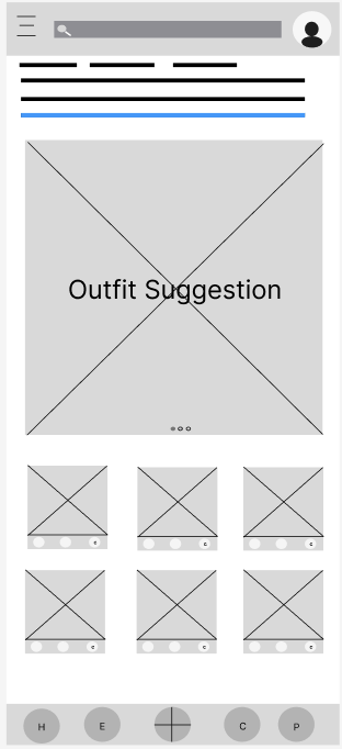
01
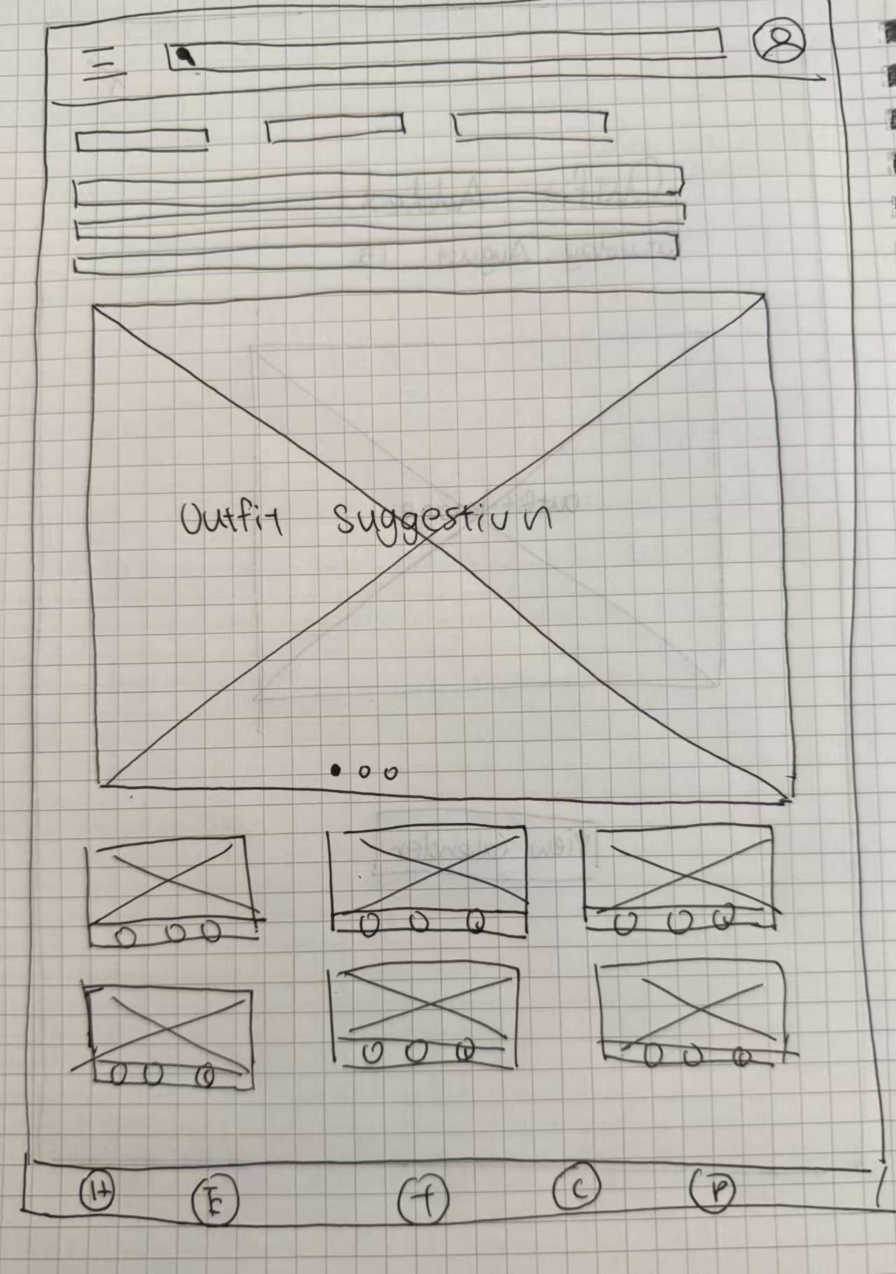
Hand-drawn homepage wireframe with search bar, weather, and outfit cards
Homepage

Search bar sits on top. The first few rectangles mark the date, temperature, and humidity of the day. The larger rectangles below are the day's outfit suggestions.

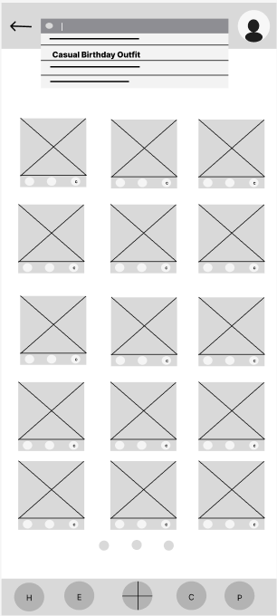
02
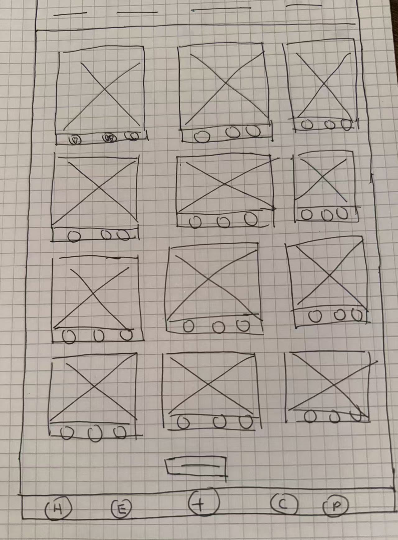
Hand-drawn search results wireframe
Search Page

After the user types in their outfit styles and requirements, outfit suggestions are generated below the search bar.

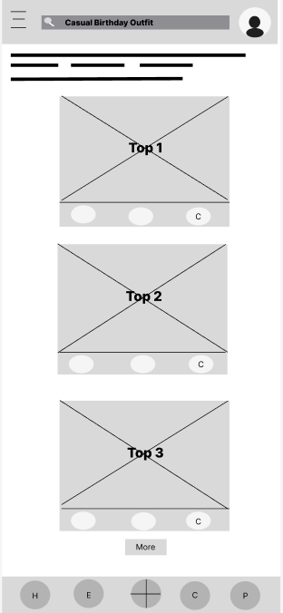
03
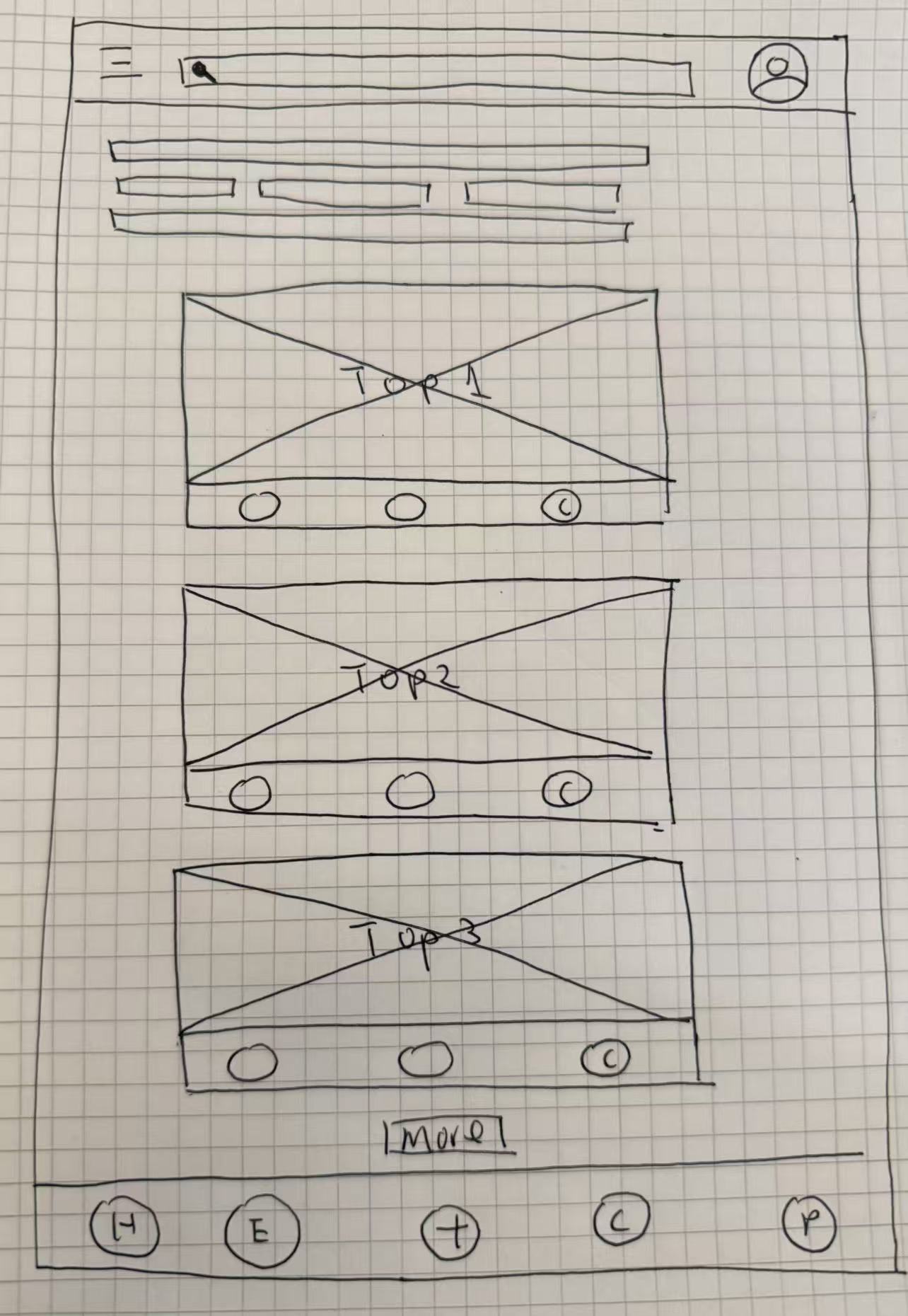
Hand-drawn top outfits wireframe with calendar markers
Top Outfits

The top three outfit suggestions show on screen. To add any outfit to the calendar, the user taps the "c" sign beneath that outfit.

04
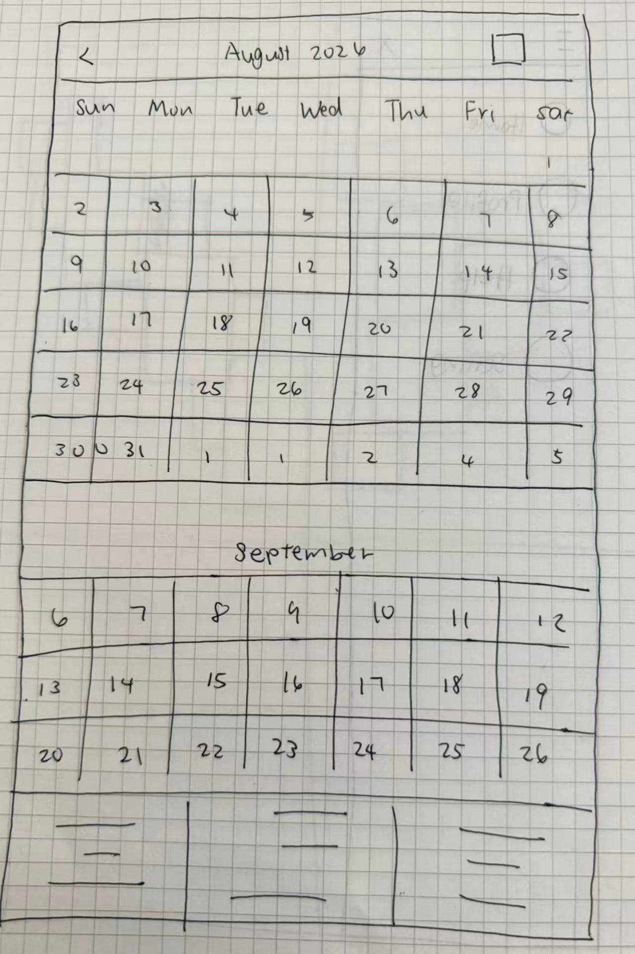
Hand-drawn calendar picker wireframe
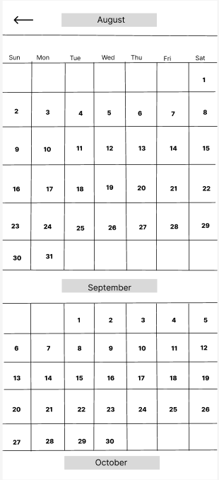
Calendar

The user can pick any date on the calendar for their planned outfit.

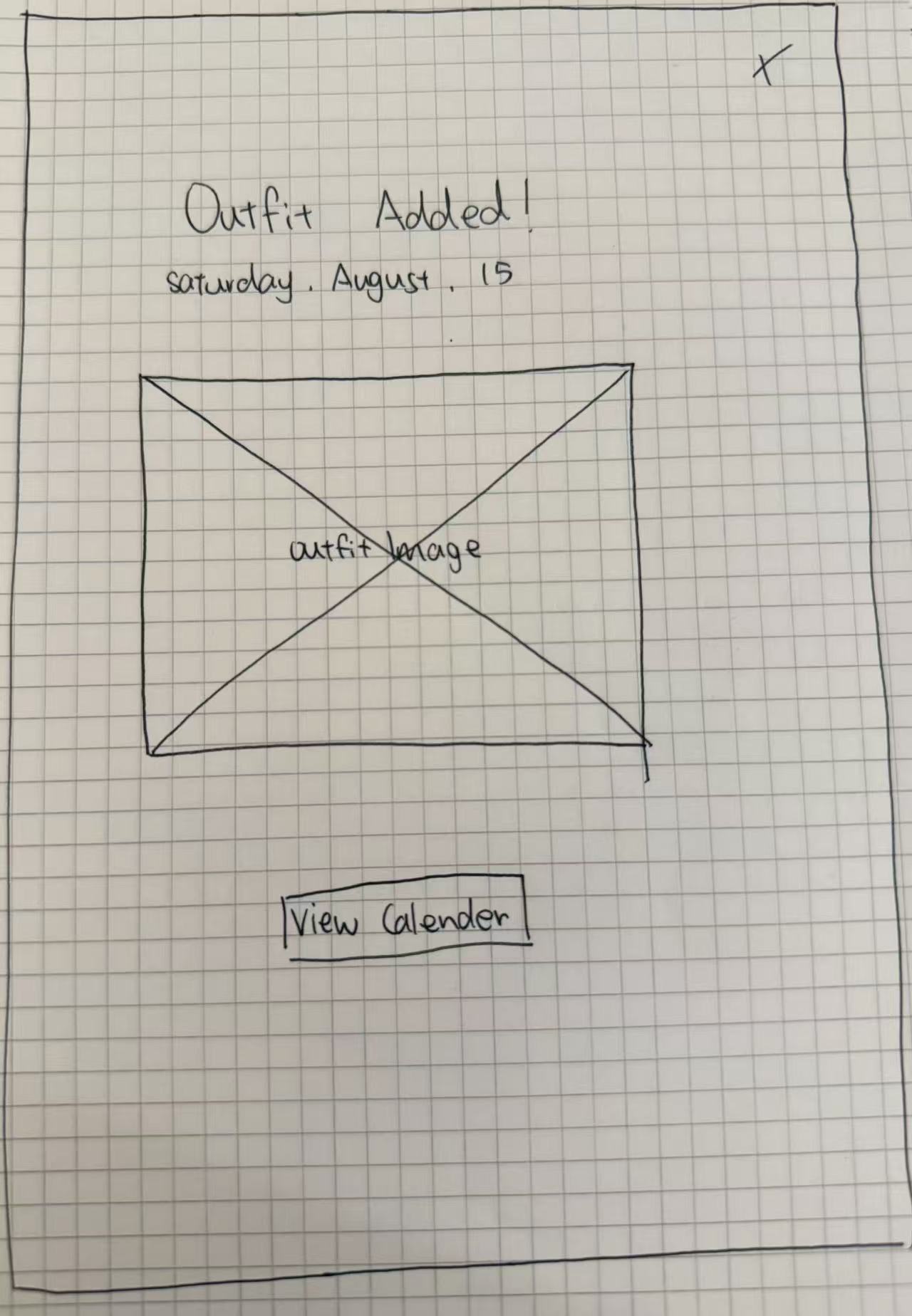
05
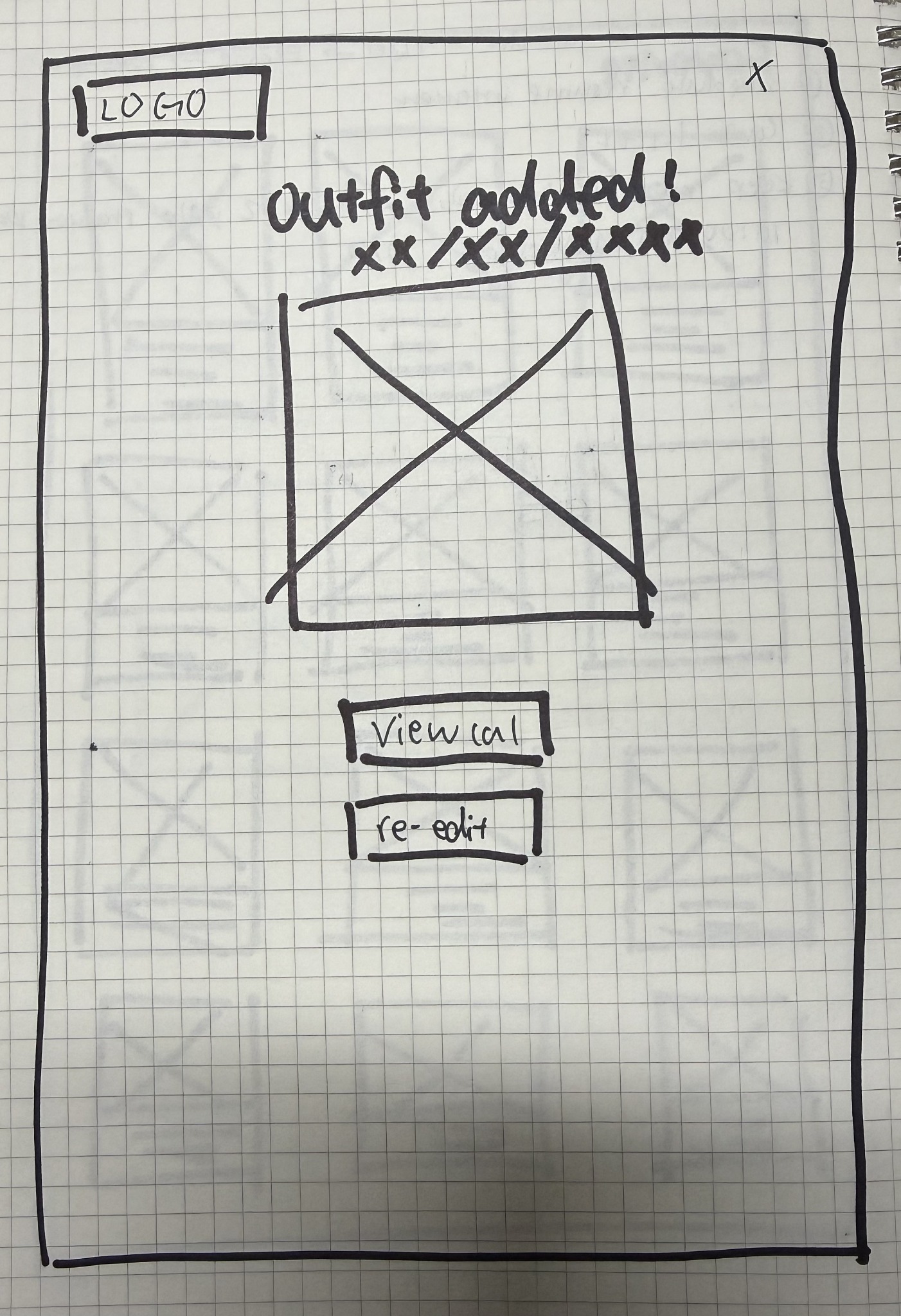
Hand-drawn confirmation wireframe with date and image
Confirmation

Once added, a confirmation screen appears: the date and a preview of the final outfit. The user can exit — or re-edit the date on the calendar.

07

Low-Fidelity Digital Prototype — Building in Figma

With the flow sketched, I translated the paper wireframes into Figma. The goal of this round wasn't polish — it was conversation. I wanted a clickable prototype rough enough that participants would tell me what was wrong without being polite about the visuals.

Click through the five frames below. Each one is annotated with what the user is meant to notice — exactly the elements the usability test put under the microscope.

Lo-fi mobile home screen wireframe
1 Search bar — starting point for every outfit query
2 Today's outfit cards, tuned to the date and weather
3 c = calendar icon to save any outfit to a date
Frame 01 of 05
Homepage — entry into the flow

The homepage had to answer one question instantly: "What should I wear today?" So the search bar anchors the top, today's conditions live in the strip beneath it, and curated outfit cards cascade below.

Lo-fi search results wireframe
1 User types occasion or style requirements
2 Suggestions generated and stacked below
Frame 02 of 05
Search Page — translating intent into options

The search experience was deliberately minimal here. I wanted to see whether plain language worked — before adding the elaborate filters that arrived in the hi-fi version.

Lo-fi top outfits wireframe
1 Top 3 outfit suggestions only
2 Tap "c" to add outfit to calendar
3 Swipe horizontally for more suggestions
Frame 03 of 05
Top Outfits — narrowing choice without overwhelming

Three, not thirty. Putting the calendar marker ("c") under each outfit was the deliberate test — would users understand "c" means calendar? (Spoiler: they didn't. Round 1 of usability told me so.)

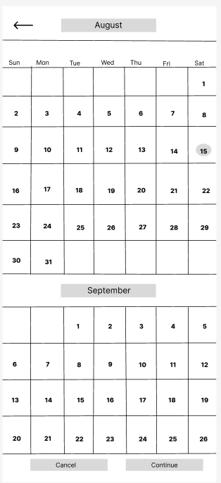
Lo-fi calendar picker wireframe
1 Month grid — pick any future date
2 Selected date highlighted in burgundy
Frame 04 of 05
Calendar — committing the outfit to a date

The calendar is what separates UniMe from any other outfit app. It answers the question: "What am I wearing on Thursday the 18th?"

Lo-fi confirmation wireframe
1 Date — confirmed at the top
2 Outfit preview — final visual lock-in
3 Exit to home, or re-edit the date
Frame 05 of 05
Confirmation — closing the loop

The confirmation had to feel like an exhale after the chaos of getting dressed — restate the date, show the outfit, offer an escape hatch for second thoughts.

08

The Prototype User Flow

The five screens above aren't isolated artifacts — they sit on a single end-to-end flow. The arrows below mirror what a clickable prototype should walk a user through.

HomeSearch · Today's picks
→
SearchType requirements
→
Top OutfitsTop 3 · Tap "c"
→
CalendarPick a date
→
ConfirmationDate + outfit

This end-to-end flow — Home → Search → Top Outfits → Calendar → Confirmation — became the spine of every usability test session that followed.

09

Usability Testing — Two Rounds, Real Friction

Format: Unmoderated, asynchronous.

Participants: Five participants completed the study independently.

Materials: A Google Form with the lo-fi Figma prototype embedded, a guided scenario, and free-response feedback fields.

Scenario given to participants: "Search for a casual birthday outfit, select an outfit recommendation from your existing closet, use the calendar icon to choose your friend's birthday, and add the outfit to that date."

After completing the tasks, participants answered: what they liked, what they disliked, and which features they would keep, add, remove, or improve. I ran two rounds, each surfacing different problems.

Round 01
What Round One exposed
  • Users need easier outfit discovery. The home screen led with a search bar, but most participants wanted to browse — they didn't know what to type yet.
  • Users want more outfit choices. Showing only the top three left participants feeling limited. They asked for scrolling galleries and broader recommendations.
  • The calendar feature may not be valuable to everyone. A small but vocal subset said they preferred a single-day recommendation over scheduling outfits weeks ahead. The feature had to become optional, not assumed.
Round 02
What Round Two uncovered
  • The core concept was generally easy to understand and useful. All five participants completed the scenario unaided — a sign that the flow itself was sound.
  • More advanced filtering options are needed. Once discovery worked, participants wanted filters: occasion, weather, style, formality. The plain search bar wasn't enough.
  • Personalized outfit recommendations are needed. Participants wanted the app to know them — their taste, their colors, their fit — rather than serve everyone the same generic suggestions.
10

Refining the Design — What Changed

Round 1 and Round 2 were never about redrawing the app — they were about sharpening what already worked. Three concrete shifts shipped into the hi-fi version:

1 · From "search bar only" to "search + filter"

The original prototype had only a search bar where the user typed what they wanted. That was too broad — and required too much typing. In the hi-fi version I replaced it with a filter function: occasion, weather, style, color, and formality. Users select what they want instead of writing it from scratch.

2 · From "today's outfit" to "today's outfit + personalization"

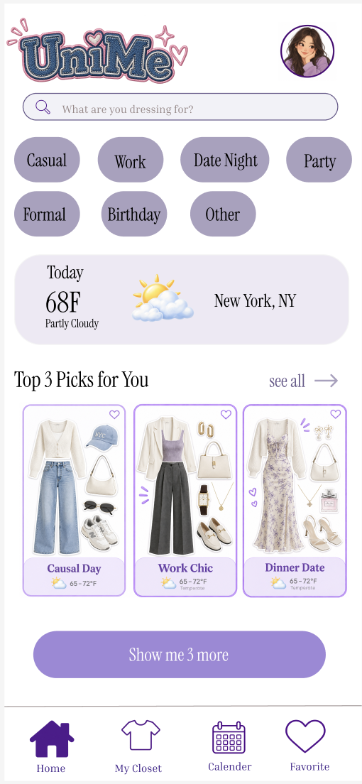
The homepage now surfaces a weather notification, three optimal outfit picks tuned to today's weather, and a parallel "plan your own" path — for users who'd rather build than receive.

3 · Accessibility & clarity

The "c = calendar" gesture from the lo-fi version was clever but invisible. I made the calendar icon explicit, enlarged tap targets, increased contrast on filter chips, and added alt-friendly copy so the experience doesn't punish screen-reader users.

Open High-Fi Mobile in Figma
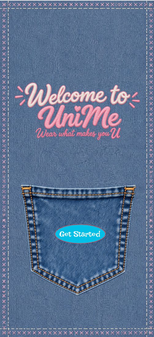
Hi-fi mobile welcome screen with vintage denim detail
Hi-fi mobile home screen with today's outfit and filters
Hi-fi mobile closet view with personalized recommendations
11

Web Companion — From Low-Fi to High-Fidelity

The mobile app was never the only surface. Outfit planning often happens at a desk — weekend browsing, looking ahead to next week's calendar, adding pieces to the digital closet. So I extended UniMe to a web companion with the same flow language, larger cards, and richer browsing.

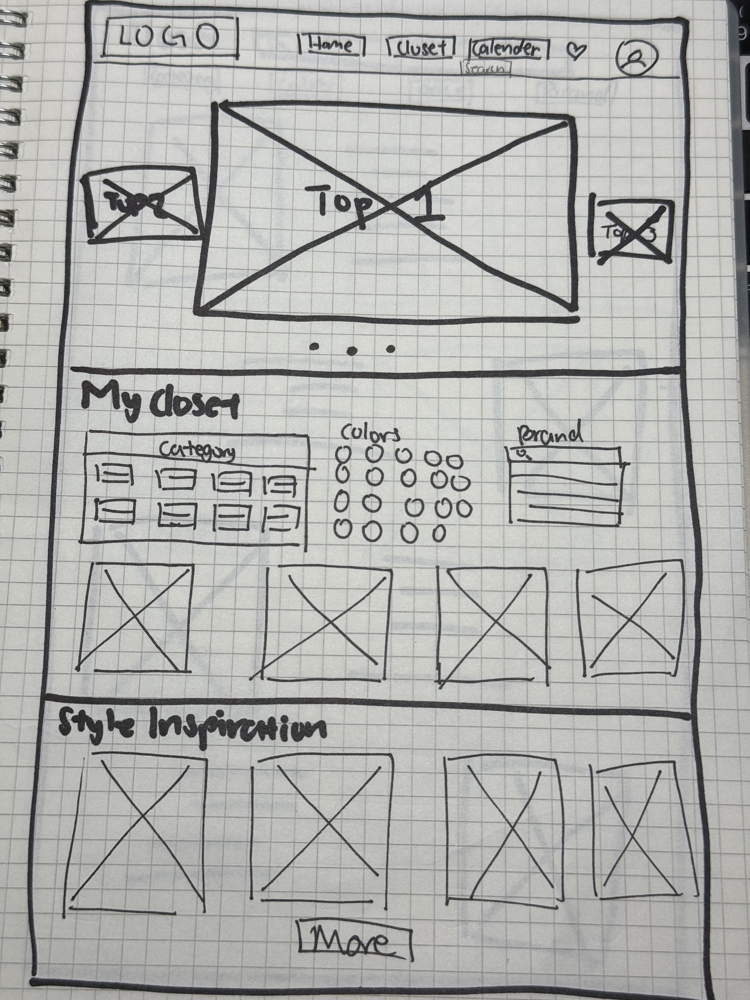
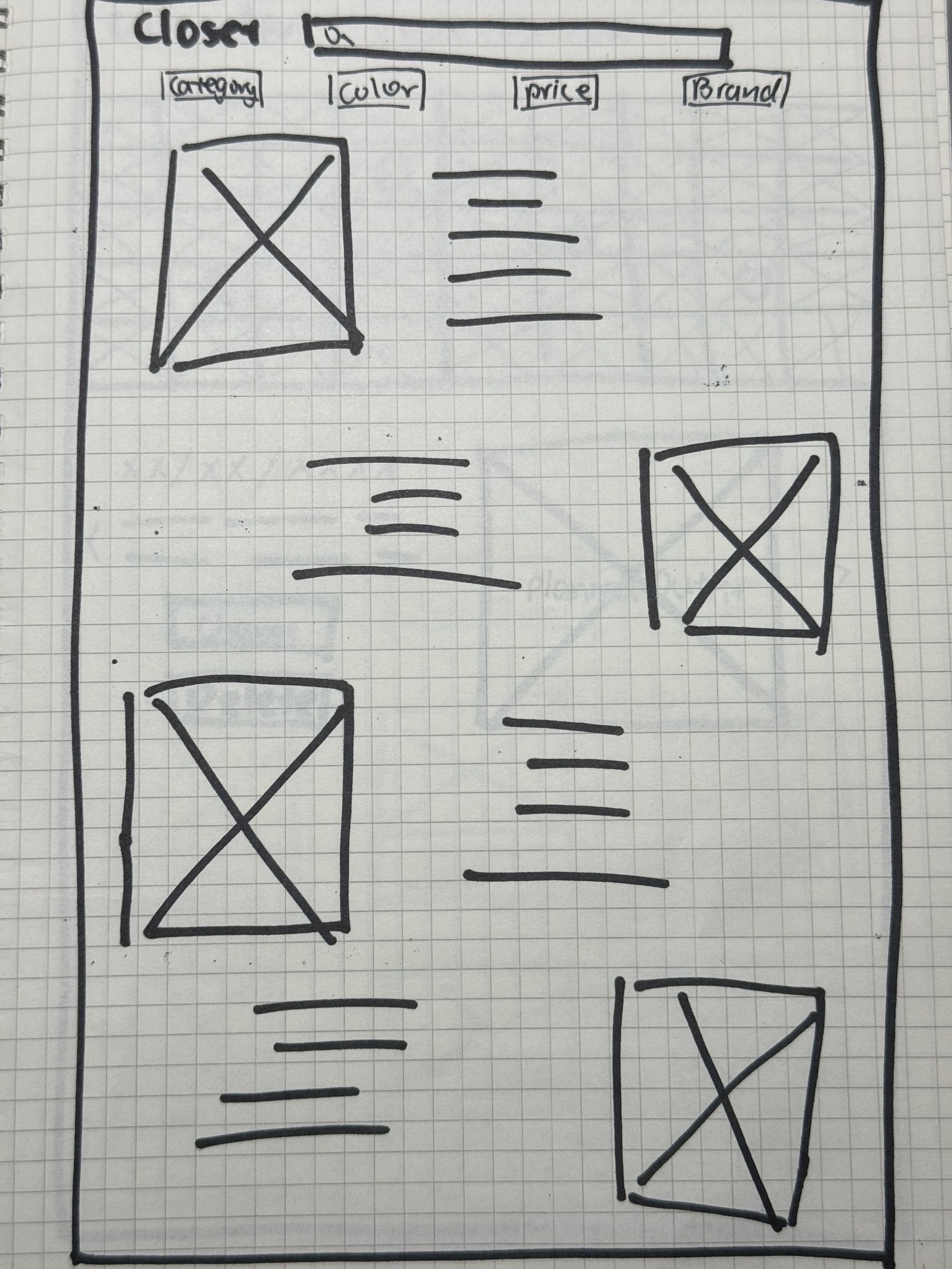
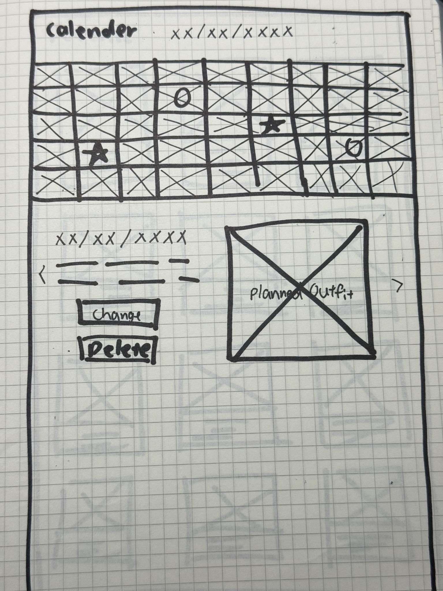
Paper wireframes (sketchbook)

These four paper wireframes show the web planning flow: Home → Closet → Calendar → Confirmation. Browse outfit ideas, explore clothing, plan an outfit for a date, and confirm it has been added.

From those sketches, the web hi-fi walk-through below stitches together the seven key scenes — from the closed closet door through to a confirmed outfit on the calendar.

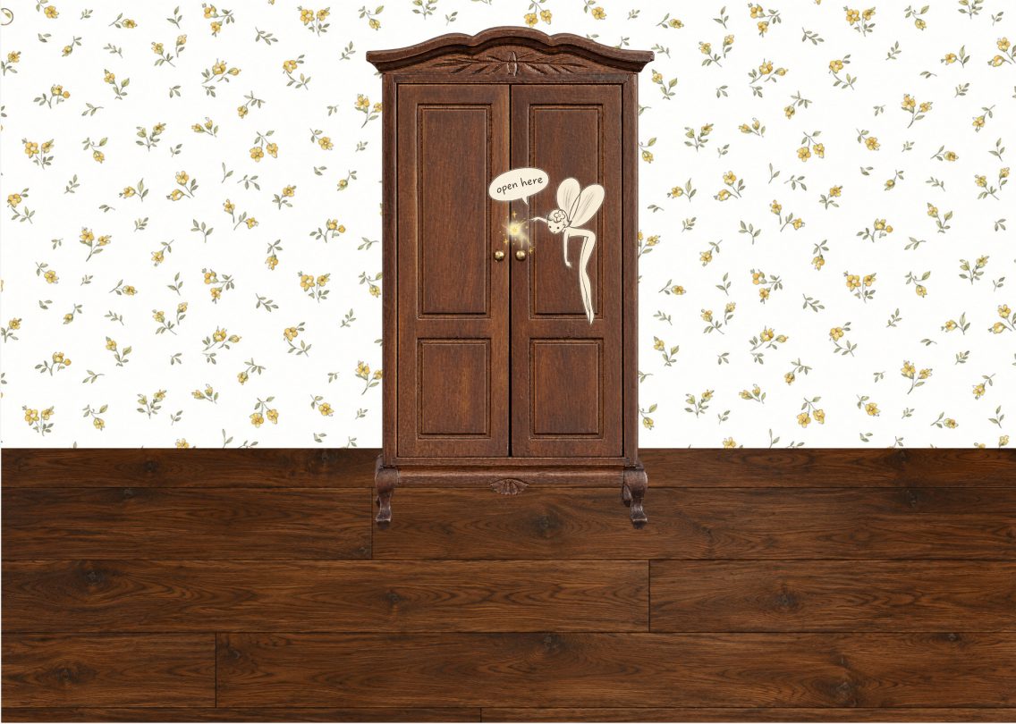
Web hi-fi: closed closet door entry scene
Web · Frame 01 of 07
The Closed Closet — landing into the experience

The web entry mirrors a real-world moment: standing at a closed closet door. Tap to step in.

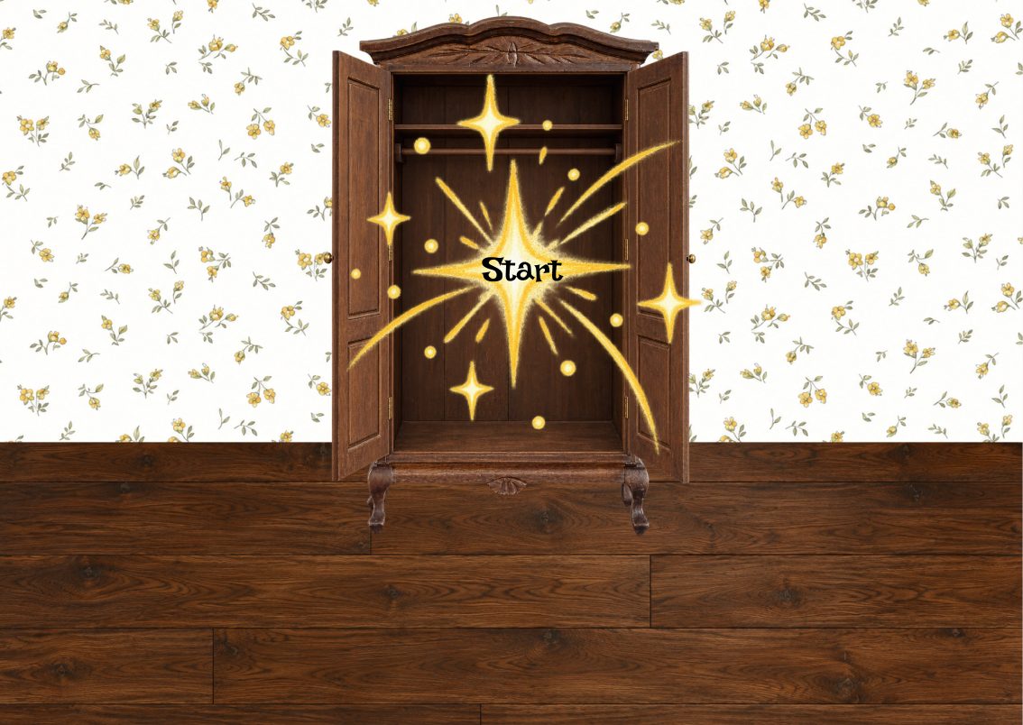
Web hi-fi: closet starting view with personal wardrobe
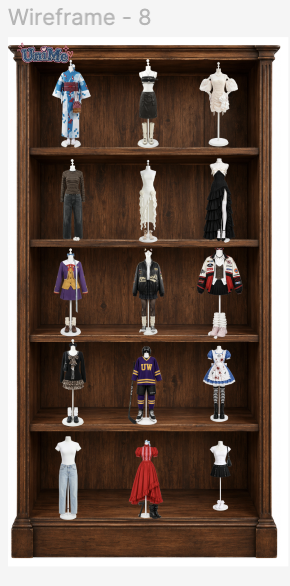
Web · Frame 02 of 07
Inside the Closet — a virtual wardrobe that knows you

Inside, the user's pieces are organized — tops, bottoms, layers — and the system already understands their style, weather, and week ahead.

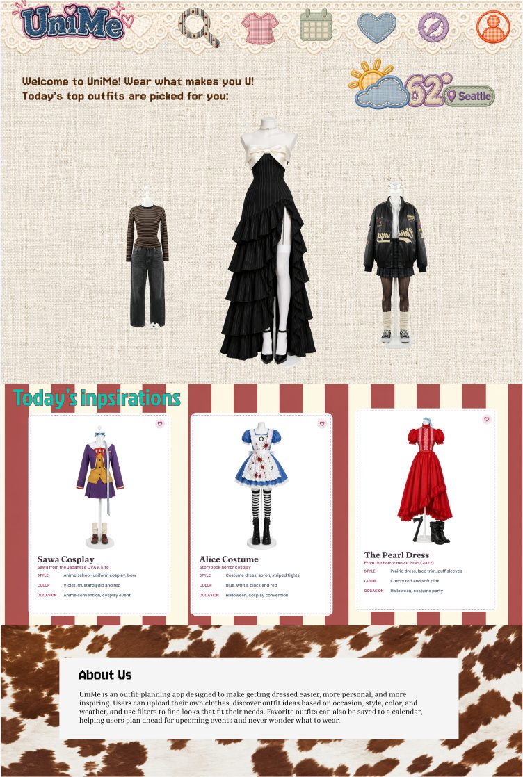
Web hi-fi: home with today's outfit picks
Web · Frame 03 of 07
Homepage — Today's Picks

The web home is more spacious than the mobile equivalent. It carries the same "what should I wear today?" intent, but lays out three outfit cards side-by-side with breathing room.

Web hi-fi: find outfit with filters
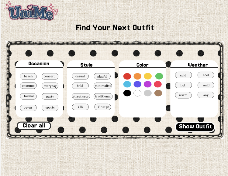
1 Find Your Outfit search bar — fast entry point
2 Filter chips: occasion, style, color, weather, formality
Web · Frame 04 of 07
Find Your Outfit — search + filter system

This is where the Round 2 feedback landed on the web. Occasion · Style · Color · Weather · Formality chips replace the bare search bar — letting users narrow intent without typing it out.

Web hi-fi: personalized outfit cards
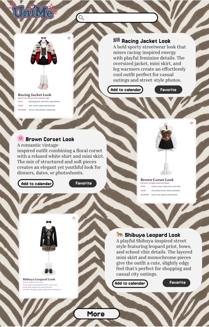
1 Personalized recommendations — top 3
2 Click any card to open the full outfit
Web · Frame 05 of 07
Outfit Cards — three personalized options

The web canvas gives each recommendation more real estate: full outfit photos, the pieces it's built from, and the tags that explain why this outfit matched the filters.

Web hi-fi: calendar with planned outfits
Web · Frame 06 of 07
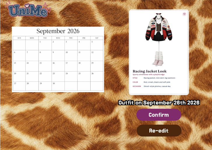
Calendar — committing outfits to dates

The web calendar runs horizontally — a week view at a glance, with thumbnails of planned outfits sitting on each day.

Web hi-fi: outfit confirmation
Web · Frame 07 of 07
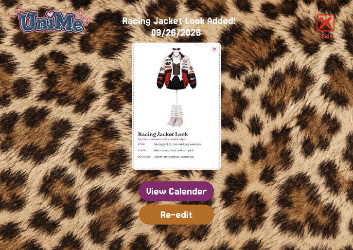
Confirmation — locking it in

The final screen confirms the date, displays the outfit, and gives the user a quiet place to either re-edit the date or close the loop.

What the web hi-fi added on top of mobile
  • Homepage design — an interactive outfit search/filter function paired with a "Today's Outfit Inspiration" section that nudges users toward styling ideas they didn't know they wanted.
  • Personalized recommendations — the top three outfits that match the user's selected occasion, style, color, and weather, surfaced from their existing wardrobe.
  • End-to-end user flow — from homepage → outfit filtering → personalized outfit generation → calendar-based outfit scheduling → final confirmation, all on one continuous journey.
12

The Complete System — User Flow Maps, Lo-Fi → Hi-Fi

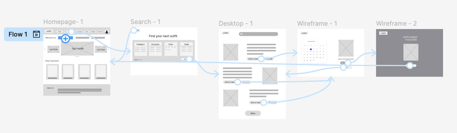
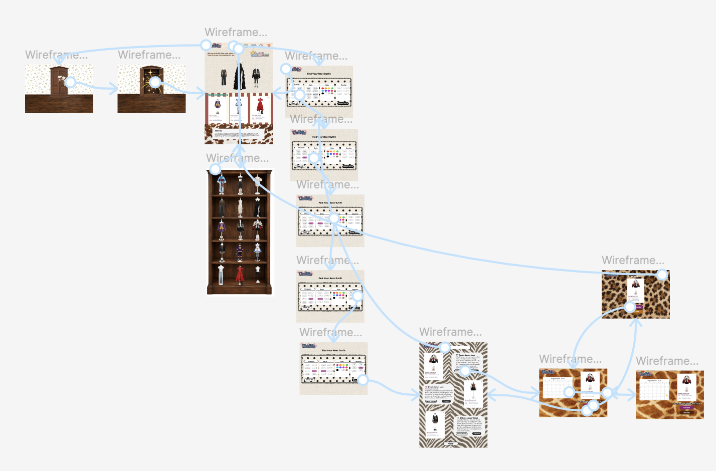
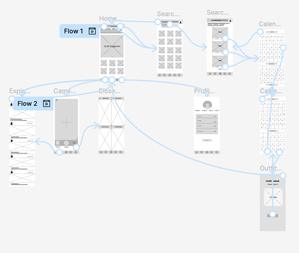
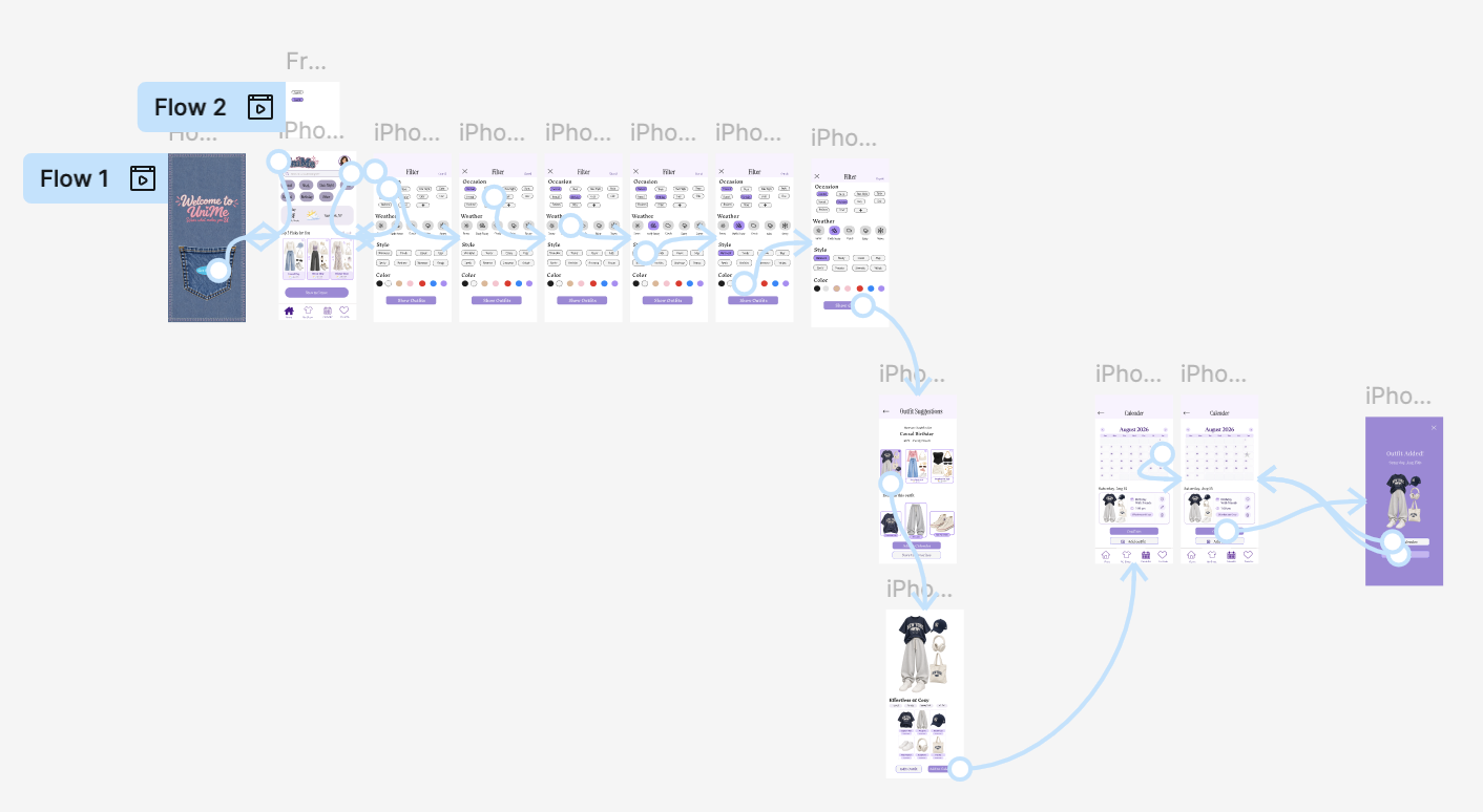
Once the screens were in place, I wired them together with the actual Figma connector lines. Below is the system map at both surfaces — the web companion and the mobile app — at lo-fi (gray box stage, structural decisions only) and again at hi-fi (visual style applied, every screen finished). Each pair tells the same story twice: first in plain shapes, then with the Burn Book / denim wardrobe aesthetic pushed all the way through.

Click any flow to enlarge — the gray-on-white is a decision map, the colored version is the real prototype.

Web · CompanionFrom gray boxes to the finished surface
Lo-Fi Flow · 1 of 2
Web — gray low-fidelity user flow: Homepage → Search → Desktop → Wireframe-1 → Wireframe-2
The web companion in gray: 5 screens, every arrow a planned decision — search-driven shopping, calendar plan, add-to-closet shortcut.
Hi-Fi Flow · 2 of 2
Web — high-fidelity user flow with vintage denim closet, leather closet, animal-print surfaces
The same map, dressed up: vintage-wood closet, leather skin, leopard bursts. Now the system reads as a real product.
Mobile · AppThe iPhone surface, mapped the same way
Lo-Fi Flow · 1 of 2
Mobile — gray low-fidelity Figma flow showing Home, Search, Calendar, plus Flow 2 with Explore/Camera/Closet/Profile/Outfit/Confirmation
Mobile in boxes: Filter → Outfits → Detail → Calendar → Confirmation, plus the second loop (Explore, Camera, Closet, Profile). Two flows, one app.
Hi-Fi Flow · 2 of 2
Mobile — high-fidelity Figma flow with denim welcome, filter screens, outfit detail, calendar view, outfit-added confirmation
Same loops, now in denim & cream: jeans-cut welcome, filter chip rows, purple "outfit added" states. The mobile app that ships.

Open Mobile Lo-Fi in Figma Open Web Hi-Fi in Figma

13

Takeaways — Impact, Lessons, & What's Next

Impact

UniMe simplifies outfit planning by surfacing personalized recommendations and pairing them with a calendar feature that helps users save time and plan ahead. It also encourages creativity — inspiring users to explore new combinations, express their personal style, and make the most of the wardrobe they already own.

What I learned

I learned the importance of understanding users' needs and concerns before designing the app. I also strengthened my critical thinking and decision-making by evaluating diverse feedback, prioritizing common needs, and balancing accessibility, functionality, and creativity to create a more engaging experience.

Research and design are not phases — they're a loop.

Future steps
  • Continue refining prototypes through at least two additional rounds of usability testing.
  • Conduct interviews with at least five participants who have tested both the mobile and web prototypes, to better understand their needs, identify pain points, and make data-informed design improvements.
  • Develop more advanced Figma skills by incorporating interactive animations, motion, and responsive interactions.
  • Expand the prototype beyond the calendar feature by designing multiple user flows — uploading clothing, creating personalized outfits, and managing a digital wardrobe.
  • Further develop UniMe's accessibility and responsive design to ensure a seamless experience across mobile and desktop devices.
  • Test the improved prototypes in realistic scenarios to evaluate how effectively users can discover outfits, navigate features, and complete tasks independently.
Behind the Work

A little about me.

Psychology · Data Science · UX. Plus a soft spot for vintage scrapbooks, Shibuya street style, and the violin.

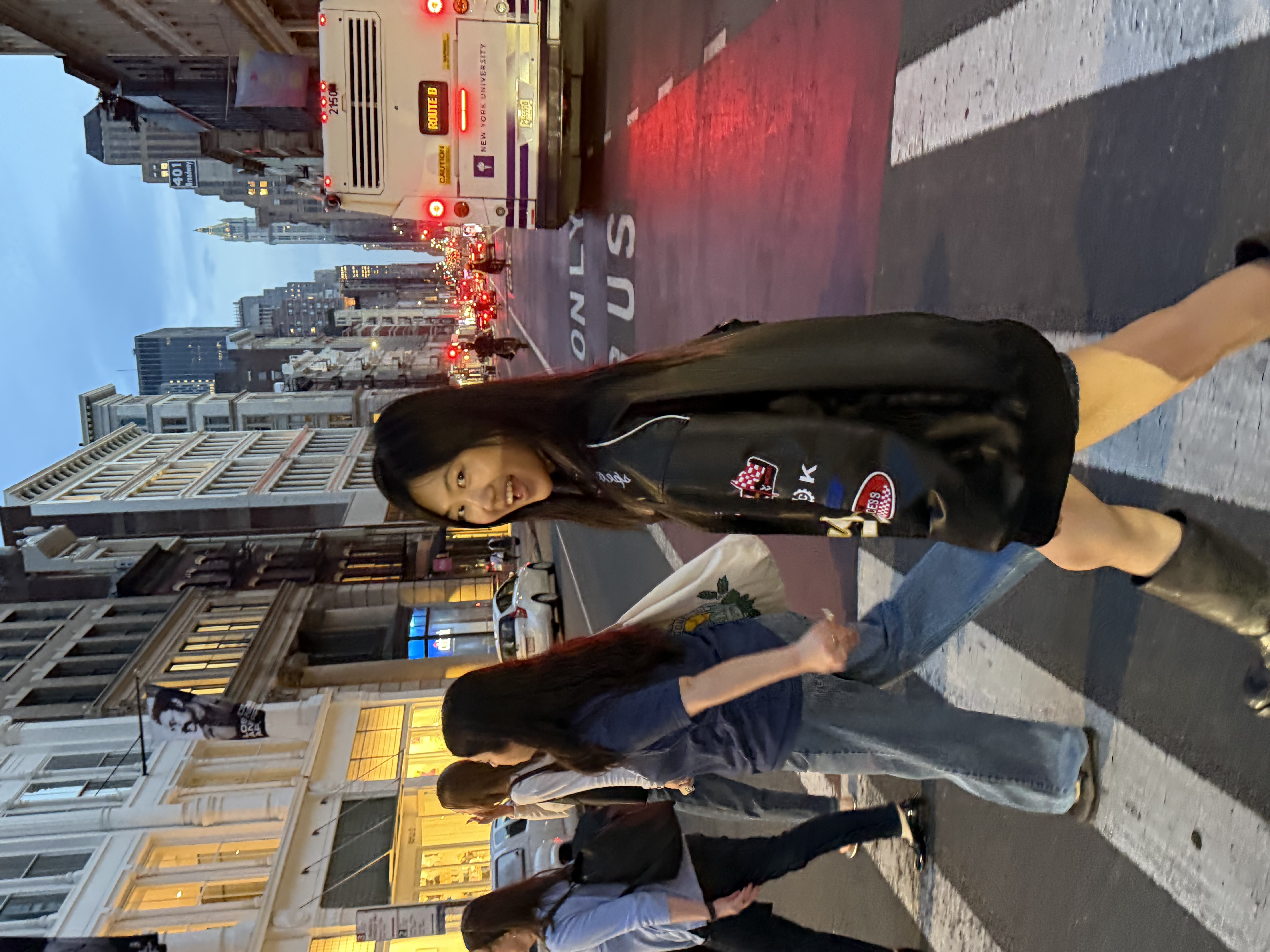
Xinyi (Sarah) Hu — a candid street photograph in New York City at dusk
Sarah · NYC · 2026

Xinyi (Sarah) Hu

UI/UX Designer & Researcher · UW Seattle · Class of 2026 (anticipated)

I'm a junior at the University of Washington, Seattle, majoring in Psychology with a minor in Data Science. I'm passionate about understanding human behaviour and turning those insights into meaningful, intentional digital experiences — combining psychological research, data-driven thinking, and human-centered design.

Beyond academics, my love for art, fashion, Chinese dance, and music (violin and piano) brings a creative rhythm to everything I make. I aspire to transform research and creativity into tangible experiences that positively impact people's lives.

Human Behaviour

Empathy maps, user research, behavioural insight

UX Design & Research

Survey → prototype → iteration

Creative Expression

Editorial, vintage, scrapbook

Skills
Figma User Research Wireframing Prototyping Usability Testing Empathy Mapping Persona Development Journey Mapping Storyboarding Data Analysis SPSS HTML / CSS basics
Download Résumé
Let's talk

Let's create something meaningful.

I'm always excited to connect with people who share my interests in human-centered design, UX research, technology, and creativity. Whether you'd like to collaborate, discuss an opportunity, or simply say hello — I'd love to hear from you.

Currently

Junior at UW Seattle, exploring human-AI interaction, behaviour-driven design, and crafting more case studies for this very magazine.

Open to

UX research internships, product design internships, human-centered design collaborations, and conversation with recruiters from teams that care about craft.

Response time

I check email most weekdays and reply within 24 hours. If you call, leave a message — I'll ring back.